How to Match Cabinet Paint Colors with Hardware for a Cohesive Look
Getting your kitchen to feel just right is more than picking a color you really like. When cabinet paint and hardware fit together, the whole space feels calm and finished. Cabinet paint hardware coordination is what helps everything tie together, so things feel like they actually belong in the same room. The paint color and finish should match, or at least get along with, the knobs, pulls, and handles. It’s not about making everything the same; it’s about making sure nothing stands out in a way that feels off.
As fall sets in around Minneapolis, more people want their kitchens to feel cozy and welcoming for the season ahead. If your kitchen still feels unfinished, it might be because cabinet color and hardware finish seem out of sync. Let’s break down how to make choices that come together, not compete.
Start with Your Style and Kitchen Design Goals
Before making any big decisions, think about how you want your kitchen to look and feel. Are you aiming for something classic, or do you want a modern twist? Maybe you hope to blend a little bit of both. Knowing your kitchen design paint style upfront makes every choice down the road simpler. If you love straight lines and cooler tones, your choices for cabinet paint and hardware will reflect that early.
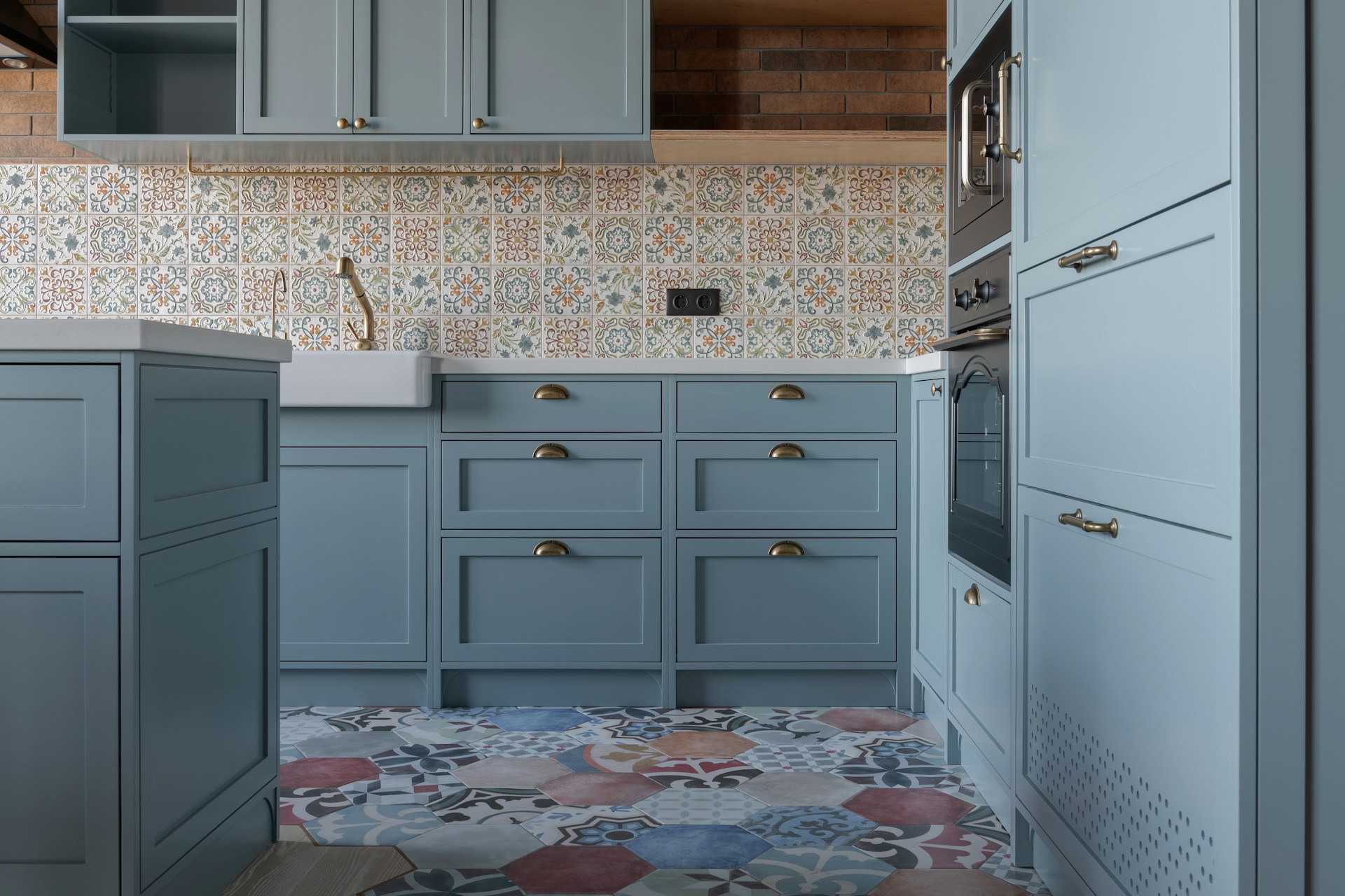
Take a close look at what is already in your kitchen. Countertops, flooring, backsplash, and appliances all add to the bigger design picture. For example, a floor with warm colors might not look right next to cool gray cabinets and shiny silver hardware. If you already have stainless steel appliances, warm brass hardware may feel out of place, so pay attention to these small details before painting begins.
Shape matters too. Look at the lines and curves in your faucet or sink. If those are rounded, soft cabinet pulls will look natural. If everything in your kitchen is squared-off or straight, like a modern farmhouse look, then more modern or sharp hardware shapes will fit right in. Matching your cabinet paint and hardware with what’s already in the space avoids a mix of items that don’t look connected.
Premium Painting offers interior painting services where we work with homeowners who want their kitchen updates to complement things like tile backsplashes, specialty trim details, or custom finishes. Making sure these fixed pieces in your kitchen are considered can make everything look put together instead of random.
Match Warm and Cool Tones for Balance
Color temperature might seem tricky, but it makes a big difference in cabinet paint hardware coordination. Cabinets in warm colors such as cream, taupe, or soft white usually look best with warm hardware like brass, bronze, or copper. That doesn’t mean every finish or shade should match perfectly, but the undertones need to blend and not fight against each other.
Cooler cabinet paints like steely gray, pale blue, or crisp white work much better with cooler hardware colors including black, brushed nickel, or chrome. It gives the kitchen a clean feel that fits together smoothly. Sometimes, what sounds fun on paper, such as deep blue cabinets with shiny gold knobs, can actually clash and look confusing in person.
Neutral paint colors like greige or off-white are very forgiving if you don’t want to spend time matching undertones exactly. These shades let your hardware stand out in a good way and keep the space flexible for lots of styles.
Minnesota’s quick-changing daylight means your kitchen can look warmer or cooler depending on the time of day or the season. Pairing the right tones of paint and hardware can make the room feel reliable and steady through all those lighting changes.
Focus on Finish: Matte, Satin, or Gloss?
Color gets a lot of attention, but finish is just as big of a deal if you want your kitchen to look coordinated. Matte or flat cabinet paint gives off a soft, comfy feeling, perfect for a cozy kitchen you want to relax in. Satin paint adds a gentle shine while being easy to wipe clean, which is helpful in a busy space.
Glossy finishes have bold energy and can highlight cabinet color, but they also make dents or scratches pop out more, especially if your cabinets get a lot of use. Each finish can fit a certain kitchen design paint vibe. Hardware finishes work the same way. Matte black, brushed nickel, or high-polish chrome all give a unique look.
Try mixing a glossy cabinet finish with polished hardware and see if it feels too flashy or busy. Go for soft satin against satin hardware to get a settled, put-together effect. The hardware and paint shouldn’t compete for attention; they should work together quietly.
At Premium Painting, skilled painters understand the different ways finishes react to light. This is important, since lighting during the day shifts how finishes and colors read in a real Minneapolis kitchen.
Test Small Samples Before Deciding
A cabinet color or hardware style might look perfect when you’re shopping online or seeing samples at the store, but things change in your home. That’s why testing small samples is an important step.
Paint a small swatch right on a spare cabinet door or scrap board and place the hardware choice next to it. Move the sample around to see it in daylight, then at night with kitchen lights on. This shows how both the color and finish behave, and if they agree with the light and style of your kitchen.
Some tips for successful testing:
- Try paint and hardware samples at three different times of day.
- Place test boards next to key elements, like backsplashes or countertops.
- Check how finishes (matte, satin, glossy) interact with cabinet shapes and hardware lines.
Remember, lighting in Minneapolis homes can change fast, especially in fall when the days get shorter. What looks perfect in bright morning light might seem off after sunset. Your light fixtures may also cast a yellow, white, or cooler blue light, changing the feel of colors and hardware finishes.
Testing helps spot things that don’t match in person, so you can fix issues early. For instance, a shiny steel handle against a rough cabinet door may not look like the same design family. You’ll find mismatches much faster by checking samples before any drilling or painting is final. If you’re not sure where to start, our guide on the best fall paint colors to create a cozy home highlights great choices that bring comfort to chilly days.
Pull It All Together with Professional Help
Once you find the cabinet paint color and hardware that feel right, bringing that vision to life is the next challenge. Getting dark tones, glossy finishes, or specialty paints to look flawless on cabinets takes years of practice and the right tools. A small mistake is much easier to spot on a shiny painted surface or next to new hardware, so a careful, steady hand is key.
Professional painters know how different finishes interact, and can handle all the details homeowners usually miss, like brush marks or small chips that can show up when adding new pulls or knobs. Matching hardware to a freshly finished door sometimes reveals small flaws, which painters can quickly fix before the job is done.
Experienced painting pros help spot small mismatches that most people overlook. Maybe your favorite nickel pull is just a touch too shiny next to your new paint, or maybe the two whites on the cabinets and hardware are a hair off. Attention to this kind of detail is what makes your kitchen look planned and well put together.
Premium Painting uses durable, stain-blocking primers and professional finishing tools on cabinet projects, so your new color and finish will wear evenly with use. These kinds of details matter, especially for kitchens in busy homes around Minneapolis.
Kitchen Coordination That Makes a Difference
When your kitchen cabinets and hardware look like they were made for each other, every part of the room works together. You don’t wonder if the knobs or pulls are the right style or stop to question the cabinet color. It just feels smooth and easy, making cooking and spending time in the space more peaceful.
The best kitchens look pulled together because of the little things: the right color matches, finishes that blend, and hardware lines that make sense with your paint. This kind of planning means your kitchen feels collected and welcoming, not random or unfinished. Choosing carefully and working with professionals makes it easy to get a kitchen that feels naturally balanced, especially as the seasons shift in Minnesota. A well-coordinated kitchen is always worth the extra planning.
Planning a kitchen update in Minneapolis? We take the guesswork out of matching colors and finishes so your space feels pulled together, not patched. From lighting and tone to the right textures, we make sure everything works seamlessly. Let us help you create a kitchen that looks and feels complete with expert cabinet paint hardware coordination. Contact Premium Painting today to get started.